Customising items#
All menu items support customisations for below parameters. All of these customisations are optional.
Color#
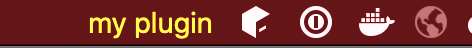
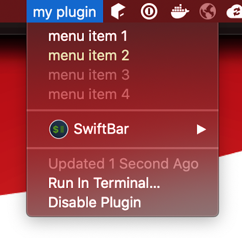
menu("my plugin", color = "yellow") {
  text("menu item 1", color = "red,pink")
  text("menu item 2", color = "#11bf40")
  text("menu item 3", color = DefaultValue)
  text("menu item 4")
}
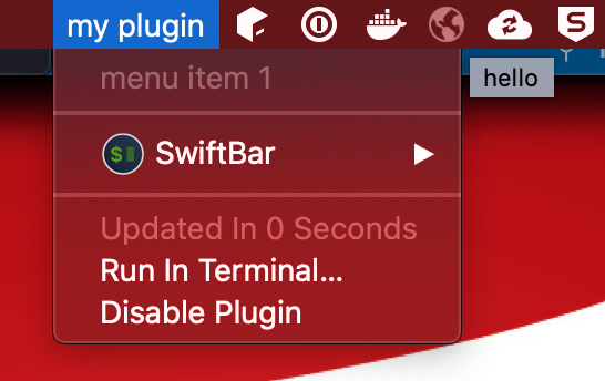
my plugin | color="yellow"
---
menu item 1 | color="red,pink"
menu item 2 | color="#11bf40"
menu item 3
menu item 4
color can take a string value representing a single color or two comma separated colors.
In case two colors are provided, first will be used for light theme and second for dark theme.
Instead of a string, you can also provide DefaultValue which will have no impact on color and render default colors.
Tooltip#
menu("my plugin") {
  text("menu item 1", tooltip = "hello")
}
my plugin
---
menu item 1 | tooltip="hello"
Renders tooltips when mouse over for few seconds
Text Size#
menu("my plugin") {
  text("item", textSize = 40)
  subMenu("abc", textSize = DefaultValue) {
    link("google", url = "https://google.com", textSize = 30)
  }
}
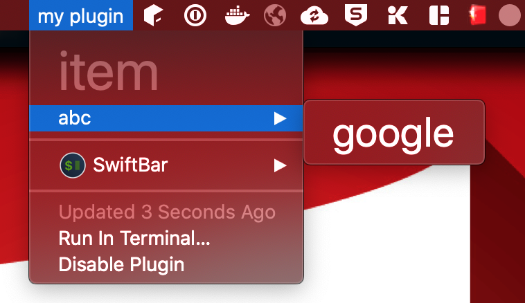
my plugin
---
item | size=40
abc
--google | size=30 href="https://google.com"
textSize can take an Int value representing font size of the menu item. You can also provide DefaultValue which will not render size attribute resulting into default behaviour of OS.
Font#
menu("my plugin", font = "Noteworthy") {
  text("item")
  subMenu("abc", font = "Times", textSize = 25) {
    link("google", url = "https://google.com", font = "Impact", textSize = 25)
  }
}
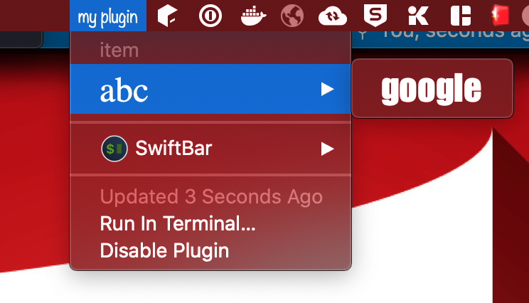
my plugin | font="Noteworthy"
---
item
abc | size=25 font="Times"
--google | size=25 font="Impact" href="https://google.com"
font can take a String value representing font of the menu item text. You can also provide DefaultValue which will not render font attribute resulting into default behaviour of OS.
Length#
menu("my plugin") {
  text("adfx zczcxzc897 zxcxzcxz cqweas", length = 10)
  text("afkljkjk lajdklsajl kasjdlks ad")
  text("asdas 08as0d sd", length = DefaultValue)
  text("asxzc q4sd", length = 50)
  link("kljlasdasd 79asdxzca asd897asd", "google.com", length = 10)
}
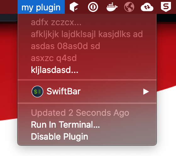
my plugin
---
adfx zczcxzc897 zxcxzcxz cqweas | length=10
afkljkjk lajdklsajl kasjdlks ad
asdas 08as0d sd
asxzc q4sd | length=50
kljlasdasd 79asdxzca asd897asd | length=10 href="google.com"
length takes an Int value. If length is provided and item text length is greater than given length, it will trim the remaining characters and append ...
You can also provide DefaultValue which will not render length attribute and text will not be trimmed.
Image#
Images are base64 values rendered as string in the image attribute of a menu item.
As of now, png & jpeg images are supported.
Swiftbar4s provides some apis to use images from resource directory or from internet using a url.
menu("Jobs", image = Image.Resource("/plugin-icon.png")) {
  text("Job 1 success", image = Image.Resource("/success.png"))
  text("Job 2 failed", image = Image.Resource("/failed.png"))
  text("", image = Image.Url("https://swiftbar4s.bilal-fazlani.com/images/creating-plugin/simple.png"))
}
More for details, check out images page
TemplateImage#
Template images use the same data types and apis as images.
Swiftbar documentation says:
Same as image, but the image is a template image. Template images consist of black and clear colors (and an alpha channel). Template images are not intended to be used as standalone images and are usually mixed with other content to create the desired final appearance.
menu("Jobs", templateImage = Image.Resource("/plugin-icon.png")) {
  text("Job 1 success", templateImage = Image.Resource("/success.png"))
  text("Job 2 failed", templateImage = Image.Resource("/failed.png"))
  text("", templateImage = Image.Url("https://swiftbar4s.bilal-fazlani.com/images/creating-plugin/simple.png"))
}
More for details, check out images page
Iconize#
Iconize provides options to add SF Symbols and/or github style emojis to menu items
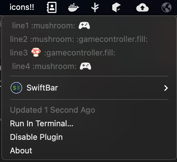
  menu("icons!!") {
    text("line1 :mushroom: :gamecontroller.fill:", iconize = Iconize.Default)
    text("line2 :mushroom: :gamecontroller.fill:", iconize = Iconize.Disabled)
    text("line3 :mushroom: :gamecontroller.fill:", iconize = Iconize.EmojiOnly)
    text("line4 :mushroom: :gamecontroller.fill:", iconize = Iconize.SFSymbolOnly)
  }
icons!!
---
line1 :mushroom: :gamecontroller.fill:
line2 :mushroom: :gamecontroller.fill: | emojize=false symbolize=false
line3 :mushroom: :gamecontroller.fill: | symbolize=false
line4 :mushroom: :gamecontroller.fill: | emojize=false
Note
This is preview is from BigSur
For a menu item, at a time, you can either specify emojize or symbolize. Both are not supported. Moreover, the default behaviour of swiftbar is different for difference macOS versions. Since SF Symbols are only supported in BigSur, they are enabled by default when Iconize.Default is used. For Catalina, Iconize.Default results into symbolize.
You can always use runtime to detect OS vesion and add custom behaviour.
ANSI#
Enables support of ANSI color codes. The official readme of Swiftbar says that is option does not work correctly when Iconize.EmojiOnly is used in the same menu item.
ANSI option can help you print colorful text messages similar to console applications using the same familar console ansi libraries
import com.bilalfazlani.swiftbar4s.dsl.*
import com.bilalfazlani.rainbowcli.*
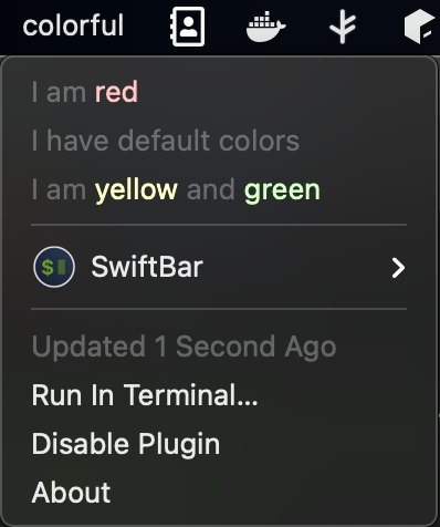
object AnsiPlugin extends PluginDsl {
given ColorContext = ColorContext(true)
menu("colorful", ansi = true) {
text(s"I am ${"red".red}", ansi = true)
text("I have default colors", ansi = true)
text(s"I am ${"yellow".yellow} and ${"green".green}", ansi = true)
}
}
colorful | ansi=true
---
I am [31mred[0m | ansi=true
I have default colors | ansi=true
I am [33myellow[0m and [32mgreen[0m | ansi=true
Note
Here, I am using rainbowcli library, but you can use any library which can print ANSI codes